


A streamlined online thrifting experience
Overview
re-fresh is looking to develop an app that allows their users interested in streetwear & luxury fashion to find exactly what they are looking for - but second hand. The secondhand market is rapidly growing and they want to be able to provide an engaging and unique shopping experience online.
Solution
I designed an end-to-end app that streamlines the thrifting experience for buyers & sellers. Through conducting extensive research and understanding the thrifting market I created a shopping experience that feels fresh with trading options & consolidated listings.
My Role:
UX Research, Wireframing, Prototyping
The Team:
My self (UX Designer)
Duration:
8 weeks
Tools:
Figma, Zoom, Airtable, Miro, Maze
CONTEXT
With ever growing concerns about the environment & sustainability, second hand shopping and resale has grown exponentially in recent years.
A large portion of this growth was seen during the pandemic, where consumers bought less apparral overall but also starting thrifting for the first time. In 2020 the market had 33 million first time thrifters, with 76% of them planning on increasing their second hand shopping.
The environmental impact of buying second hand and reselling is huge, and shoppers are defintely noticing. Consumers care more about sustaniale apparel than ever before. With this, saving money has also become a concern & customers are looking to resell more than ever. Over 35 million consumers starting selling in 2020 and that’s just the beginning.
With so many buyers & sellers in the market, the convenience of online thrifting is essential, but what it is missing?
FINAL DESIGN
A streamlined online thrifting experience
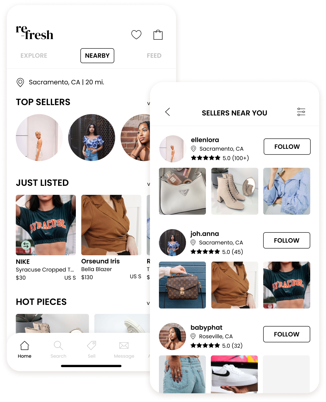
Explore what & who is nearby
A common sentiment during my interviews was that users were looking for a way to shop local. Many fashion thrifting platforms are limited to shipping only, you don’t have the option to pick up an item locally since they ship from a warehouse.
The re-fresh home page allows users to explore nearby listings and sellers. They can set their radius as far as they would like, to find other users to trade with or simply save on shipping by picking up items locally. They have direct communication with the sellers and can decide amongst themselves how they want to set up a pickup if they’d like.

Make an offer - a trade offer
While users were interesting and happy to spend more money for quality items & shopping sustainably, they wanted a way to trade or swap clothes if they didn’t want to simply buy or sell pieces. They were also looking for some more engagement when it came to the thrifting experience.
While users can make a price offer if they would like, they can opt to trade for their own items as well to save some money & keep their closets fresh. Users can opt to meet up & swap their pieces or simply ship items out if they’re not close enough. Sellers can opt in for trades, to let their buyers know what is & isn’t up for grabs, at a glance.
Save time sorting through listings
With so many products and so many sellers, there are bound to be multiple listings of the same item. Trying to sort through all of these to find the perfect size and compare prices can be daunting and extremely time consuming.
re-fresh works to consolidate these listings in a collection under the product listing to simplify this process. Like an item but its not in your size? You can check for other listings in your size immediately. It’s your size but too expensive? Find a cheaper one with one tap.
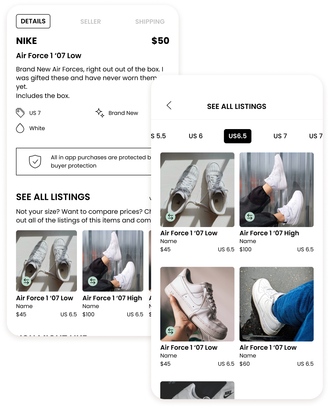

To ensure this works, when listing an item users are prompted to look for matches of other listings. This allows for items that have been selected as matches to fall under the See All Listings collection.
How might we allow for buying & selling online in a more efficient & quick way?
RESEARCH
What is missing from online thrifting?
While thrifting has grown exponentially during the pandemic, online platforms & marketplaces have been around for quite some time. I wanted to look at what companies were dominating the market right now and if there were any gaps that could be filled.
A competitive analysis and some market research pointed out a few things:
there was no place for women to buy and sell specifically luxury & streetwear in one place
there were little to no options to buy both locally and online
Key Insights
I understood that there were some gaps, but do they matter to shoppers? Through some interviews & surveys with real second hand shoppers, it was apparent that there were some major pain points and needs in the online thrift space:


“I love thrifting but sorting through all of the listings trying to find what I’m looking for just takes so much time, even online”
-Participant 3
DEFINE
What did re-fresh need to prioritize for thrifters?
Online thrifting takes the in person experience of sorting through products to a whole new level & it was crucial to streamline this experience to avoid users from feeling overwhelmed.
To combat this, when thinking of the structure of the app, there were a few key functionalities I needed to keep in mind:
Communication between buyers and sellers was key
Users need to be able to find local sellers nearby to trade with
There needs to be an efficient way to find and compare sizes and prices
IDEATE
What was actually possible to easily implement?
While I knew what pain points users were facing when thrifting online, the challenge here was creating simple & efficient solutions that could be easily developed.
This resulted in multiple brainstorming sessions where I played with my insights & How Might We statements. With that I crafted extensive task and user flows to better understand possible solutions and ensure a seamless experience.
After playing with the flows I opted for 2 key features that I used to create a sitemap to ensure a solid structure off the app with no gaps:

DESIGN
Creating a fresh environment for shoppers.
re-fresh is modern, chic, & minimal. They look to give users access to vintage, luxury, & streetwear pieces at a lower price while keeping sustainability in mind. Their customer wants to be both fashionable and ethical. With this in mind, I opted for a visual identity that was clean & fresh with cool green & teal tones.
Differentiating their brands from competitors was crucial. Each competitor was targeting a different audience & re-fresh had to do the same for theirs to fill that gap in the market.
EXPLORATION & ITERATION
Iterate, Test, Iterate
There were so many elements to the different areas of the app and the features that I needed to figure out - that meant multiple rounds of iterations to take on. I started this process by crafting up some high-level sketches to get rough ideas on paper before diving into the details.
The Early Wireframes
After sketches I created a few variations during my wireframing phase. As I continued to iterate, I would show my mentor whose feedback meant even more iterations. There was so much meaning in every detail and it was important to ensure they all contributed to making this an pleasant experience for the user.
It was here that I realized, while quite simple, the inconsistency in primary & secondary buttons could be confusing. Testing proved that getting to nearby listings & sellers were easy enough - but the buttons felt off. A perk of nearby sellers is the option to trade - this needed to be apparent. But, the trade labels were redundent & overwhelming - they were ultimately simplied to icons.
Optimizing Trade Options
Testing showed that users found the trade offer quite easily - placing it under Make Offer was intuitive. The real issue here was that while initially the flow was much shorter, it didn’t encompass all of the users needs. Users weren’t sure what they could offer to trade. The new flow allowed them to see & pick from their own listings or offer something else altogether. The new flow also accounted for a confirmation page to reassure users that their information was how they wanted it.
Clarifying See All Listings
While initial designs did give information on what See All Listings was all about - it didn’t give them the whole picture. Users were unsure what would happen after clicking the button and what made it different from the other recommendations. To combat this, See All Listings was changed to a collection, giving users an text & visual explanation of the feature.
Another piece to this puzzle was ensuring the Listing process accounted for consolidating the same products. To ensure this would work - the process includes a screen where users would select a listing that matched the item they wanted to list. A/B testing was done here to decide what formatting would work. Users ultimately favored larger images to easily see details.

OUTCOME
Final Thoughts
This was a challenging project to say the least. As a fashion enthusiast myself, I know how easy it is to opt for fast-fashion to keep your closet fresh and new. That being said, it is possible to stay trendy and keep the environment & sustainability in mind. Second hand shopping can be daunting, especially online and designing an app to simplify that was no easy feat.
Bringing the initial idea to life was difficult but fulfilling. I struggled to find a balance between something traditional & something fresh and creative. I wanted users to have an intuitive experience that was still unique and efficient.

What I learned:
How to work the constraints of limited resources and images for my final mockups
Creating a strong brand identity through smaller design elements and a minimal color palette
Focusing on usability through testing before finalizing the colors and UI
Next Steps:
Clean up my files & prepare them for handoff
Research new features that make shopping second hand easier
Further test & iterate my designs